
The Flower Shop
Overview
This student project began as a logo redesign for a local flower shop. The goal was to reimagine the existing identity and create a refined, modern logo that better reflects the shop’s personality, craftsmanship, and connection to nature. The project expanded beyond the logo into a complete branding system, including a curated colour palette, typography, packaging concepts, social media assets, and in-store applications. By applying the visual identity across multiple touchpoints, the project demonstrates strategic thinking and the ability to create a cohesive and consistent brand experience.

Process
-
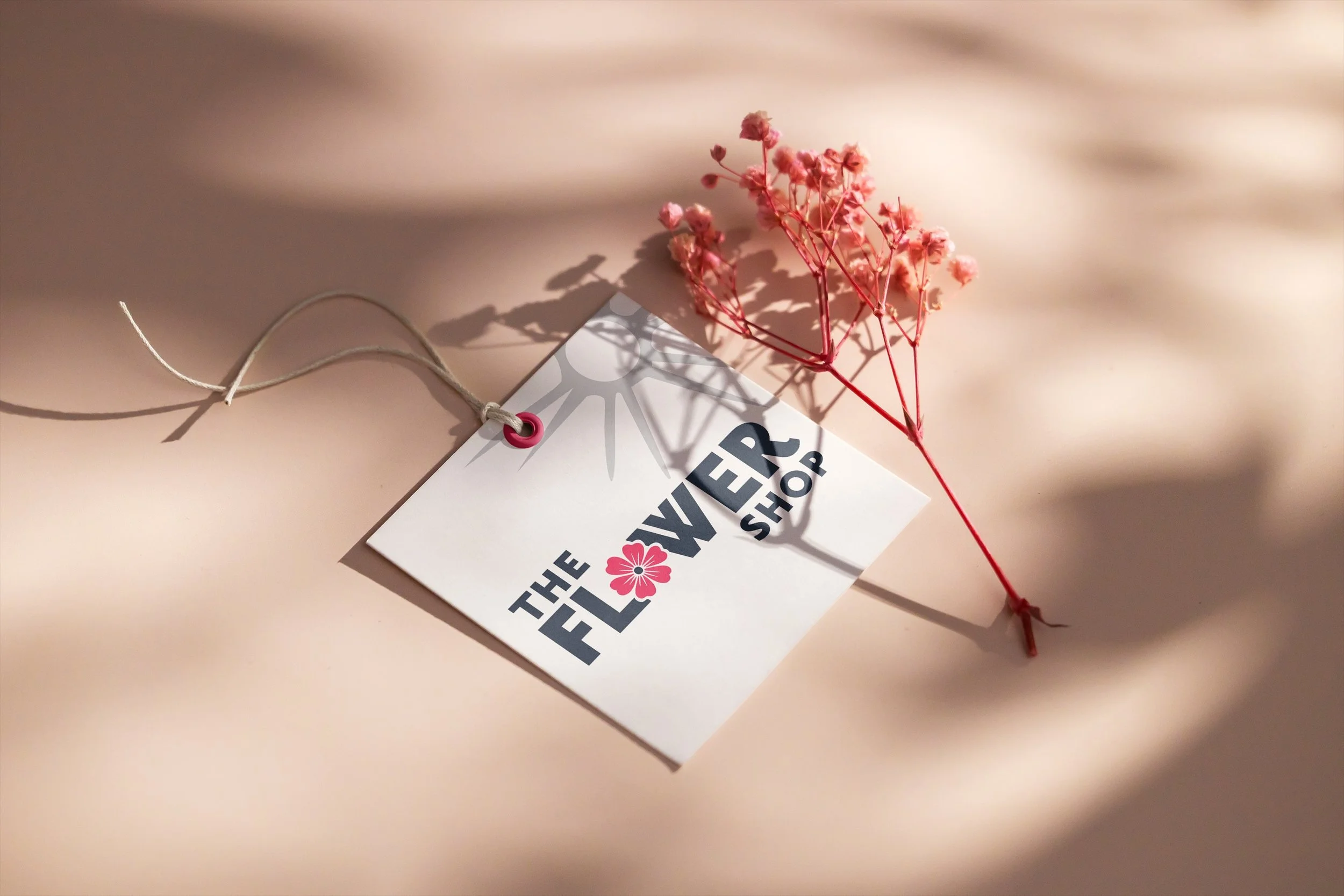
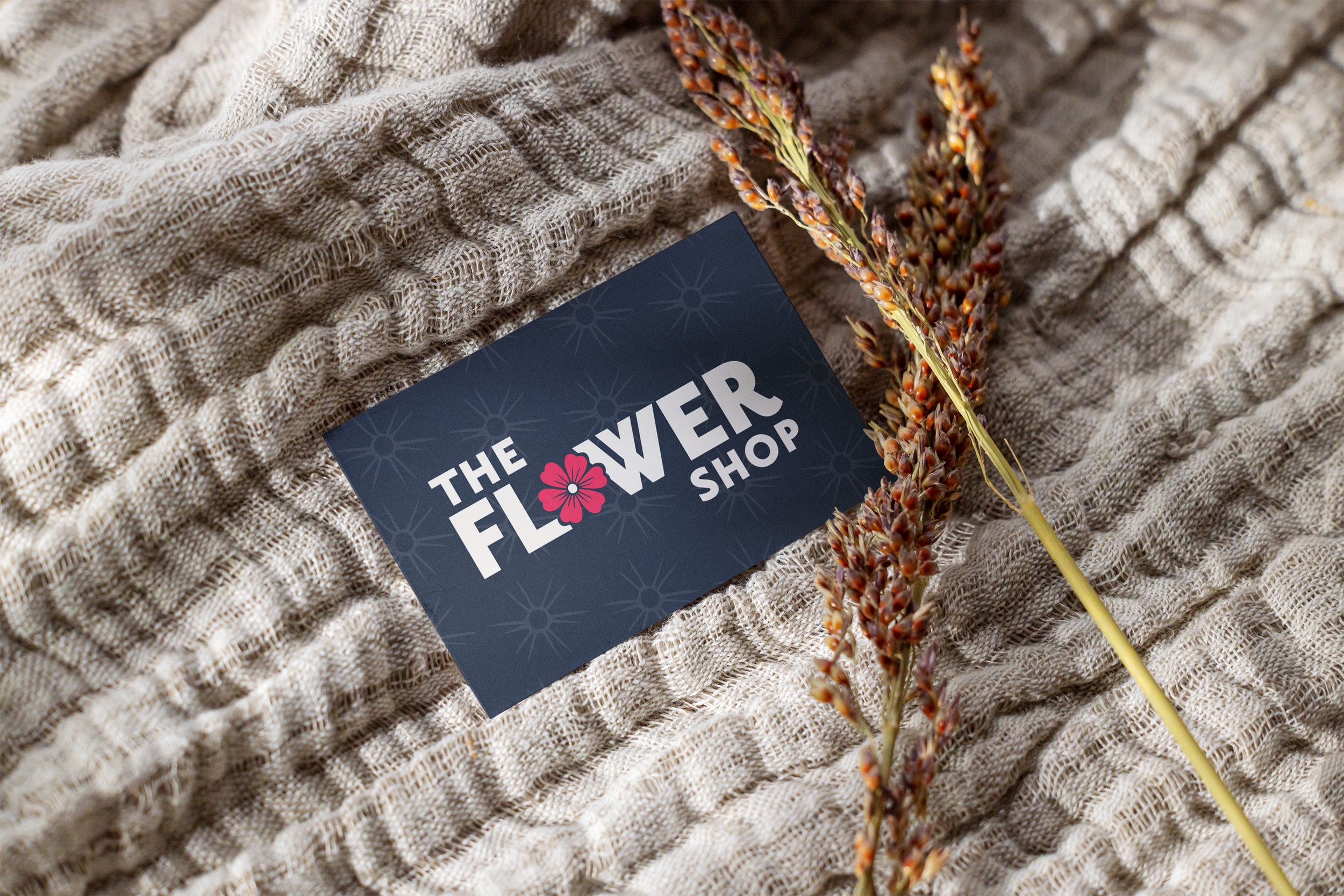
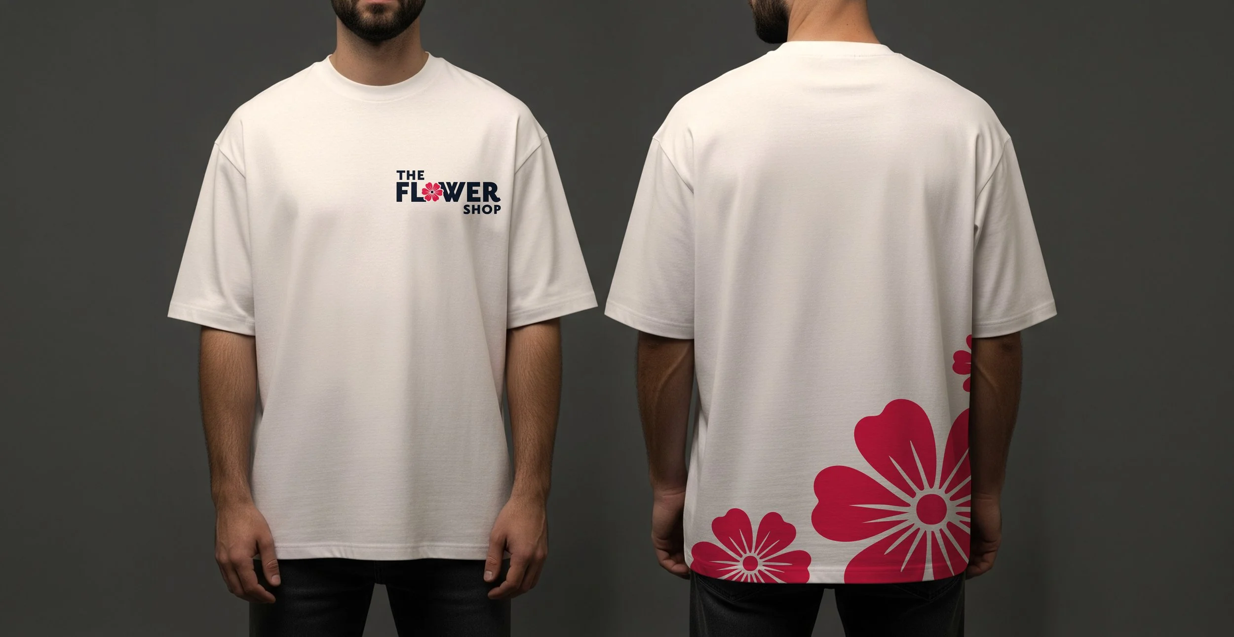
Logo Redesign
This student project began with researching the existing identity of The Flower Shop and identifying opportunities to modernize the brand while still maintaining a connection to nature and handcrafted floral arrangements. Initial sketches explored different ways to integrate floral imagery directly into the wordmark. Through refinement and digital iterations, the final concept focused on creating a clean, balanced logo that feels contemporary while still reflecting the softness and organic qualities associated with a flower shop.
-
Typography & Color
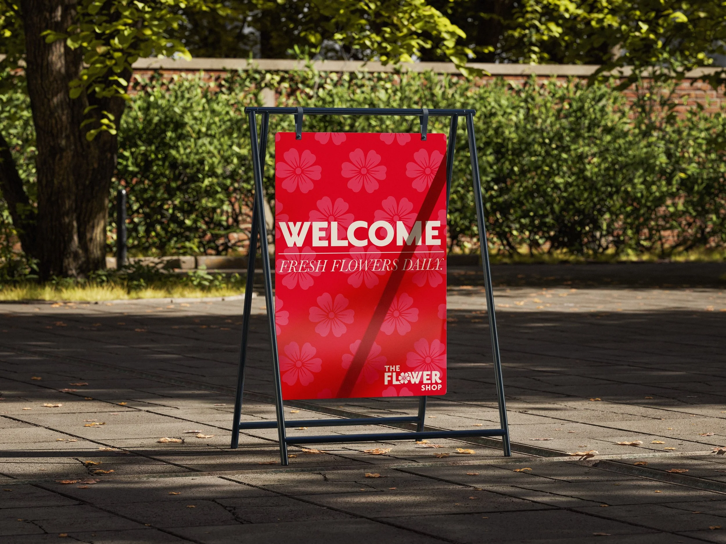
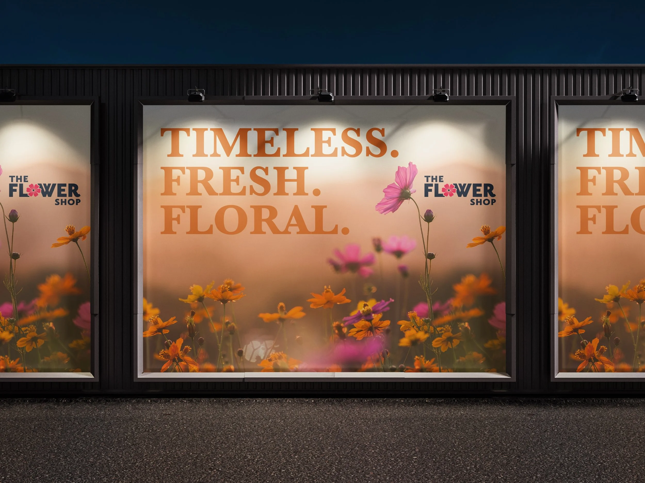
The typography uses a bold, modern sans-serif style to create a strong and legible wordmark that stands out across packaging and promotional materials. The clean letterforms provide contrast to the delicate floral imagery, helping the brand feel both modern and approachable. The colour palette centers around a bold pink paired with a neutral dark blue. The pink reflects flowers and warmth, while the blue provides balance and professionalism. Together, these colours create a simple yet recognizable identity that can be used consistently across multiple brand touchpoints.
-
Graphic Elements
A simple flower icon is integrated into the wordmark, replacing the “O” in “Flower” to create a distinctive focal point and strengthen the connection to the shop’s floral identity. The center of the flower is also used as a repeating graphic motif throughout the mockups. This pattern draws from the natural structure of the flower and adds subtle visual interest while reinforcing the brand concept. By extending this element beyond the logo into supporting graphics, the design creates a cohesive visual language that can be applied across packaging, tags, signage, and other branded materials.